How I designed and structured my RogerLab portfolio
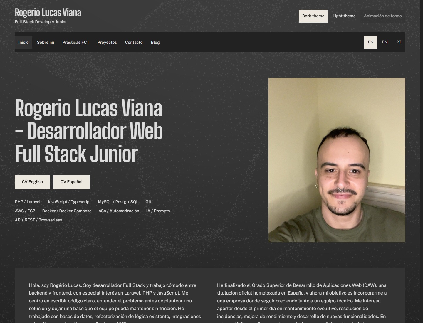
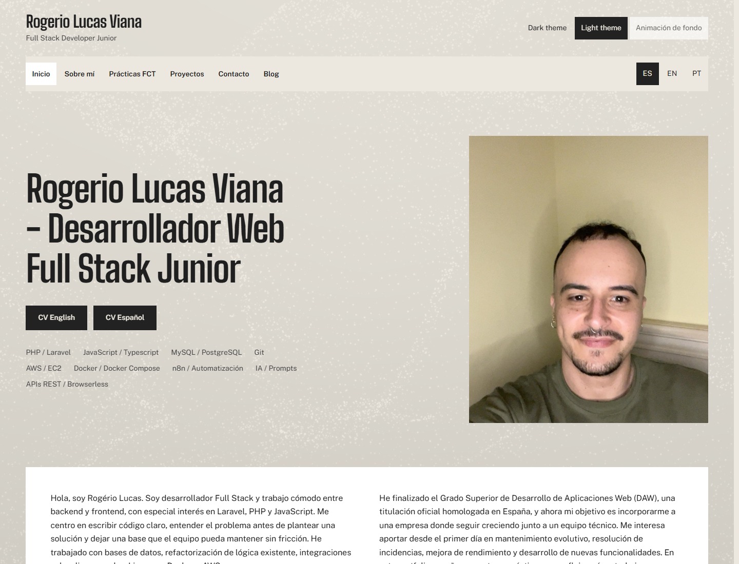
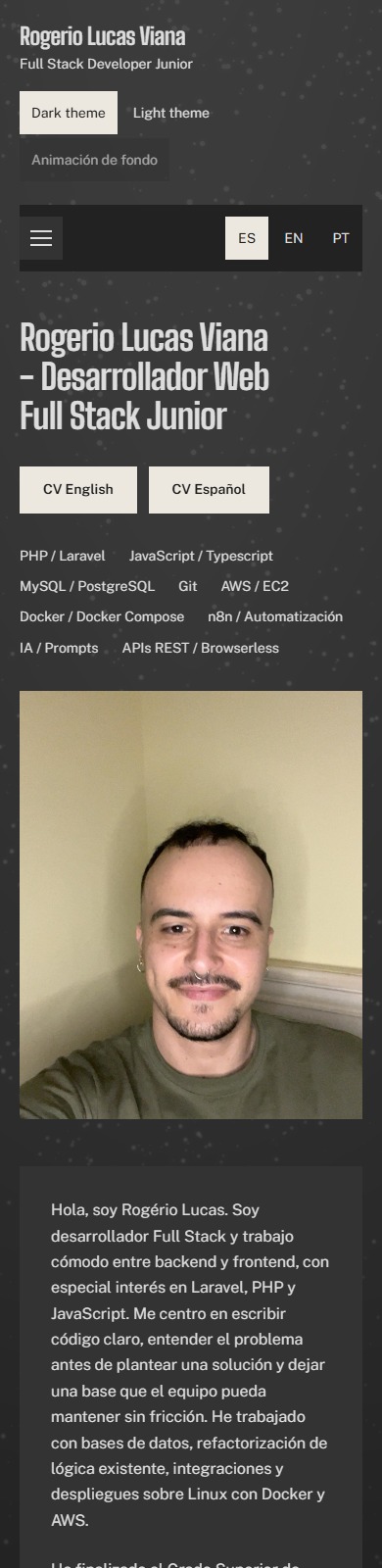
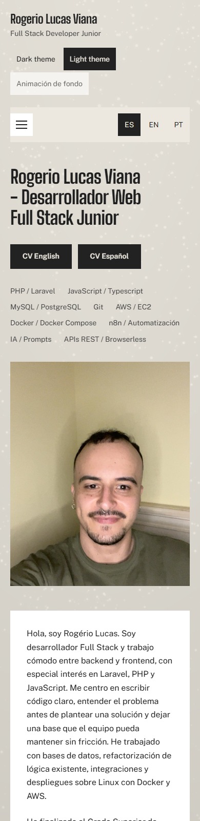
Image 1 of 4
A web development portfolio should show more than a list of technologies. It should also help visitors understand how the person behind the projects works: the decisions they make, how they organise their work and what they consider important when building an application.
That was the starting point for redesigning RogerLab. The goal was not to change its identity, but to present my work more clearly and create a structure that can continue to grow with me.
A clearer visual identity
I kept the charcoal and ivory palette, with both light and dark themes. Building on that foundation, I worked on visual hierarchy, spacing and typography so that each section has a recognisable purpose and the information is easier to explore.
Headings use Big Shoulders, while body text uses Public Sans. This combination distinguishes the presentation from the supporting content without introducing too many typefaces or decorative elements.
I also preserved the animated particle background, one of the website’s distinctive details. The animation can be paused and respects the device’s reduced-motion preference. It is intended to support the content, not compete with it.
A structure built around my work
The homepage introduces my profile and provides direct access to my CV in Spanish and English. From there, the portfolio is organised into sections covering my skills, professional internship, projects, contact information and this blog.
In the projects section, each piece of work has room to explain its context, the technologies used and how it works through images and links. The aim is not simply to display a screenshot: I want visitors to understand what I have built and explore the result.
The internship section brings together my experience and what I learned during that period. The contact section completes the journey with a way to discuss professional opportunities and collaboration.
Navigation stays visible as visitors scroll, making it easier to move between sections, particularly on pages with more content.
The technology behind the design
The portfolio is built with Laravel and Blade templates. Styles are organised using Sass and shared CSS variables, while TypeScript handles browser interactions. Vite and Gulp prepare the assets for deployment.
I kept this stack throughout the redesign. Rather than adding tools for every visual detail, I prioritised reusing styles and components, keeping the structure understandable and avoiding unnecessary dependencies.
Colours, spacing and control styles follow a shared system. This makes improvements easier to apply consistently and reduces differences between pages.
User experience is part of development
The design adapts to phones, tablets and desktop screens. Beyond its appearance, I worked on contrast, visible keyboard focus, control sizes and animation behaviour.
The portfolio’s general content is available in Spanish, English and Portuguese. Each blog post has separate fields for all three languages, including its title, body text, SEO metadata and alternative image descriptions.
A new space to share the process
This blog adds something that was missing from the portfolio: a place to explain the work that is not always visible in a finished demonstration.
Posts can include one image, several images in a manual carousel, or no images at all, in which case the RogerLab logo is displayed. Publishing is managed through a private panel, separate from the public reading experience.
I want to use this space to share technical decisions, improvements, challenges and practical lessons. This first post is the starting point: an explanation of how I built the place where I will share my progress as a developer.
Back to the blog